
Composition (legacy)
Composition - Legacy Token Type
The Composition Token is a Token Type we initially introduced to support design decisions that are typically composed of multiple parts, like typography, shadows and borders.
Since then, a lot has changed.
The Design Tokens Community Group (DTCG) hosts a token specification on the W3C community group pages for web standards. Although it's in draft form, the tools and technologies working with Design Tokens are trying to align with the W3C DTCG specification.
The W3C DTCG specification defines each of these composite design decisions as their own Token Type instead of a generic composition Token Type.
→ See the W3C DTCG Spec 9.0 Composite types for more details
You might have noticed Tokens Studio is aligning to the W3C DTCG spec by introducing as many of the same Token Types as reasonable and feasible.
We now support typography, border, and boxShadow as independent Composite Token Types.
INFO
We encourage our community to migrate from using the 'legacy' composition Token Type to a corresponding official token type, as we may deprecate it in the future.
We know some of you love the idea of Composition Tokens as a way to have a single token which captures the values of as many design decisions as possible applied to a component. In fact, many of you have requested features to push this idea even further.
While this doesn't align with the direction of the W3C DTCG spec for a Token Type, it could be an interesting feature the Tokens Studio team could work on in the future.
The way it works today
The Composition Token allows you to combine multiple design decisions into a single Token.
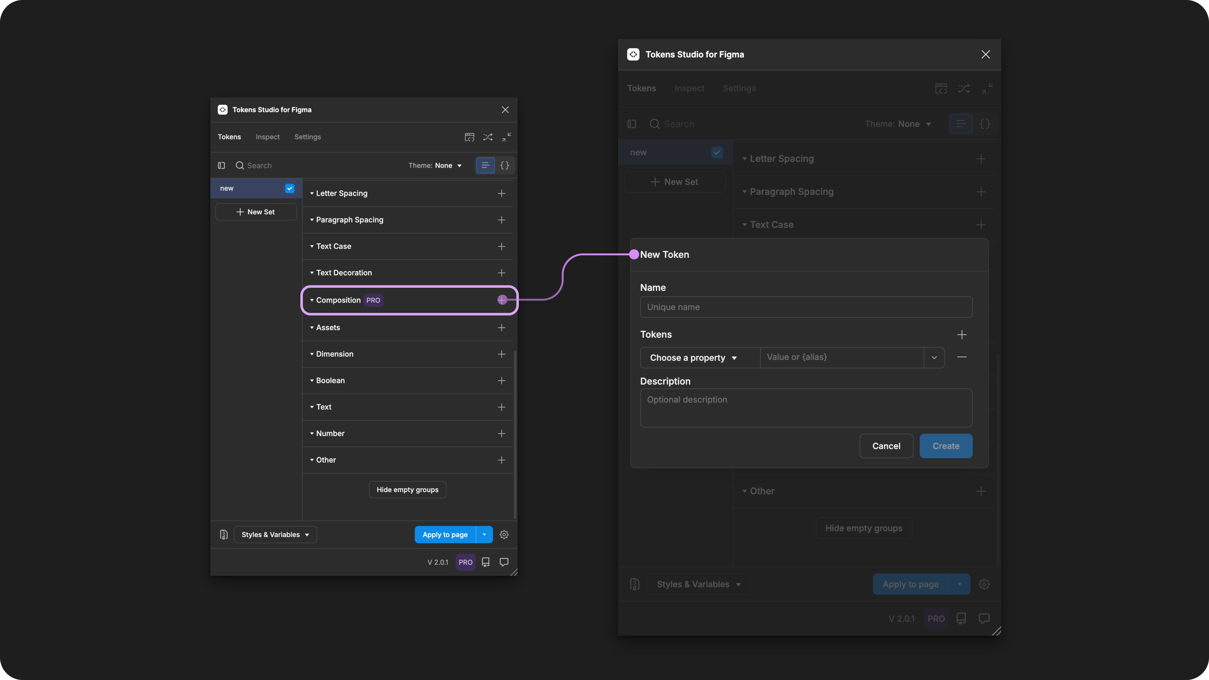
Creating a new Composition Token in the Tokens Studio Plugin for Figma.
When you apply a Design Token to a design element in Figma, the properties are applied to a single layer.
This means that if you try to apply a single Composition Token to a component, like a button, it will only apply the styling properties to the layer it's applied to: the container, the text, or the icons.
It is not possible to define a single Token (of any Type) for all children layers within a design element.
It's important to note that if you use the Composition Token Type, any individual property Tokens defined in the value that are attached to Styles or Variables in Figma will not show in the Figma UI as Styles or Variables.
We suggest replacing your Composition Tokens over time with the independently defined Token Types included in the W3C DTCG specifications.
- There are numerous challenges with transforming these tokens so they are usable in code.
- We have several bugs and known issues open specific to this token type.
Transforming Tokens
When transforming Composition Tokens, which are not an official Token Type, the SD-Transforms package has to do a lot of heavy lifting to split out the individual 'Property Tokens' with it so they are usable in code.
The problems related to transforming this token type have been described as "untenable to work with" by Joren Broekema, the lead engineer maintaining Style Dictionary, in this GitHub Issue.
Composite Tokens require the SD-Transforms option to expand composite Tokens into multiple Tokens.
Make sure you look at the generic SD-Transforms package to include this option, which allows you to further customize this transformation further using Style Dictionary.
→ SD-Transforms Read-Me Doc, Using the preprocessor
→ SD-Transforms Read-Me Doc, Using Expand
Resources
Mentioned in this doc:
- SD-Transforms - Read Me
- Style Dictionary - Read Me
- Design Tokens Community Group - W3C Draft
- Design Tokens Community Group - 9.0 Composite Types
- Request to remove/deprecate Composition Tokens - Github #2800
Known issues and bugs
Tokens Studio Plugin GitHub - Open issues for Token Type Composition
- Composition Tokens On Text Don't Theme Switch After Closing and Reopening the Plugin 2881
- Blank composition properties causing the fill property to not be applied to Figma layer 1943
Requests, roadmap and changelog
- Deprecate Composition Tokens and replace with a 'template' feature. → Request