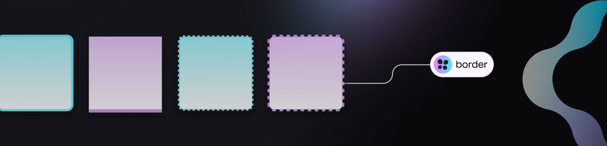
Border - Composite
Border - Composite Token Type
Add visual separation to design elements by composing several stroke-related design decisions as a single Border Token.
Each design decision (color, border width, and stroke style) that is a part of the Composite Token is referred to as a property of the Border Token in our guides.
INFO
It's important to note that radius properties are not a part of the Border Token and need to be applied independently.
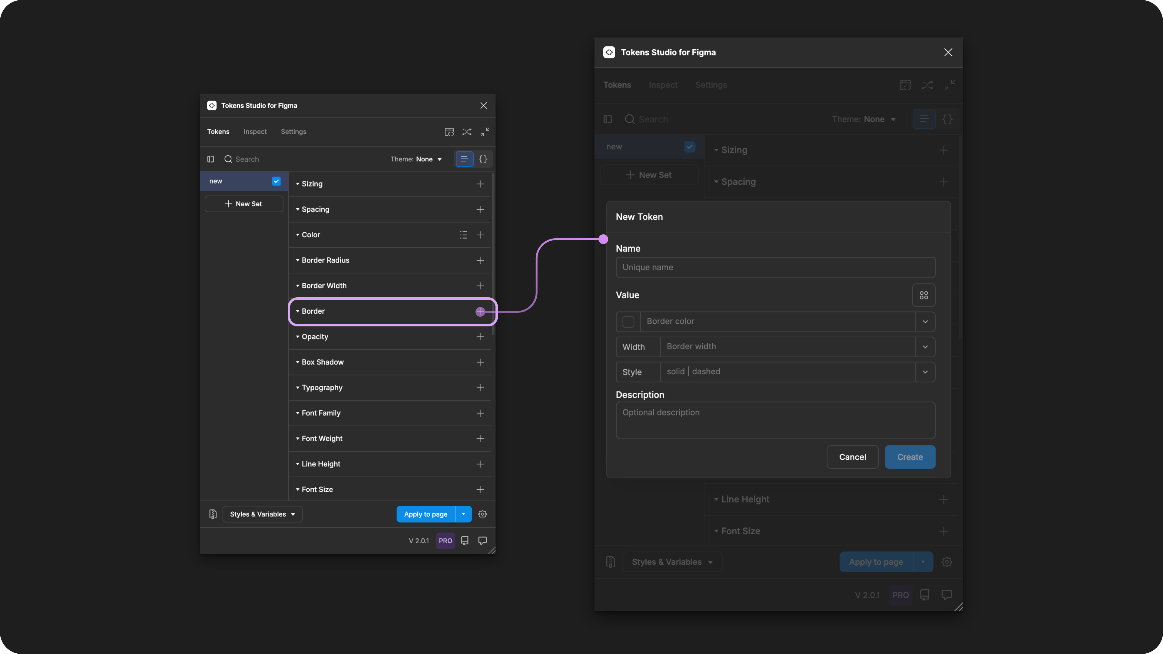
Creating a new Border Token in the Tokens Studio Plugin for Figma.
Design decisions
The Border Token defines the stroke styling properties for containers, text elements, and polygonal shapes.
The properties within the Border Token closely align with the border property in CSS.
Each property composed to create the Border can be defined as it's own Token and referenced within the Border Composite Token**😗*
- Color
- Border Width
- Stroke Style
Possible values
Like all Composite Tokens, you define the value of each property individually.
When you create the Border Token in the plugin, you can reference each Token you've already created as a property or enter a hard-coded value.
INFO
The best practice is to define all parts of a Composite Token, even with a null/none value, rather than to leave it empty.
Hard coded values
The dedicated Token Type of each property within the Border Composite Token has unique specifications, described in detail in their own technical docs.
Step 1: Border color
Border Color defines a solid, reduced opacity, or modified color value written in any color space supported by a Color Token.
You can also use the color picker to create the value by selecting the swatch to the left of the input.
→ Jump to the Color Token guide
Step 2: Border Width
Border width defines the thickness of a stroke around a design element and accepts numeric values, ideally with a unit of measure.
For example 1px
→ Jump to the Dimension Token guide
Step 3: Stroke Style
Stroke Style defines the line shape. It's value is written as a string depending on your desired style.
solid creates a continuous line.
dashed creates a line of many small sections.
- You can adjust the fine-grained settings for the dash using the Figma UI as there currently isn't a Token Specification for it.
- Tokens Studio does not have a dedicated Token Type for Stroke Style at this time.
INFO
The syntax used to write string values for Design Tokens is important!
Be sure to write the value of the stroke style property all lowercase letters and ensure there are no spaces.
Values that reference another Token
Like all Composite Tokens, you may reference an existing Token as the value for each individual property, as described above ↑.
If you'd prefer to reference an existing Border Composite Token as the value instead of defining each Property, select the Token's Reference mode button (2x2 circle icon).
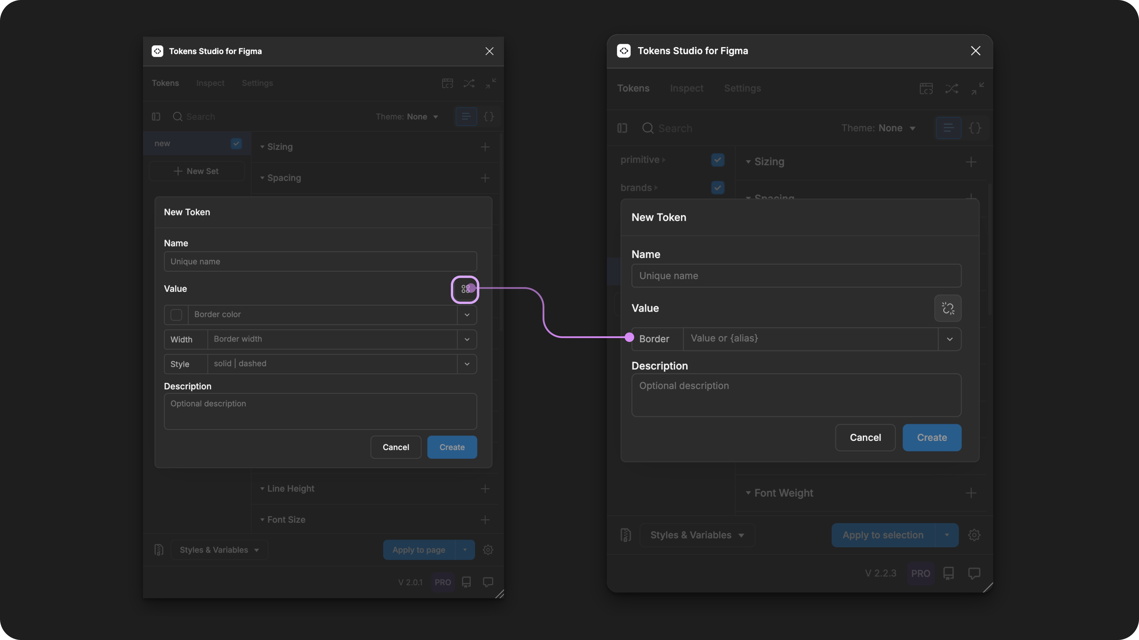
With the Border Token form open in the Plugin, select the reference mode icon button to change its Value input. This allows you to reference another Border Composite Token as the value.
When trying to reference another Token as the Value for a Border Token, you will see:
- Tokens living in Token Sets that are currently active.
- In the left menu on the plugin's Tokens page, a checkmark is visible next to the Token Set name.
- Token Type is compatible:
border
Apply Border Tokens
A Border Token defines the stroke styling of text, polygonal shape, frames, groups or graphic elements in Figma when the Token is applied.
You can apply a Border Token to all sides of the design element at once, or each side independently.
With one or more elements selected in Figma, right-click on the Border Token Name in the Plugin to its options.
Select your desired design property by clicking on it to apply the Tokens value instantly.
INFO
If you click the name of Token to apply it to an element without accessing the right-click Token menu, the Border styling will be applied to all sides.
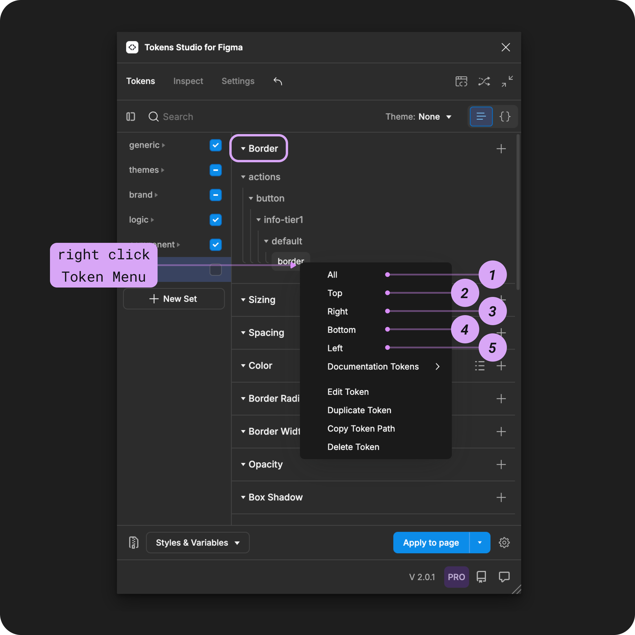
The right-click menu of a Border Token is open to reveal the design properties it can be applied to in Figma.
Step 1: All
Apply the Token value to the stroke on all sides of the selected design element.
Step 2: Top
Apply the Token value to the stroke on the element on the X-axis only.
Step 3: Right
Apply the Token value to the stroke on the right side of the element on the Y-axis only.
Step 4: Bottom
Apply the Token value to the stroke on the lowest side of the element on the X-axis only.
Step 5: Left
Apply the Token value to the stroke on left side of the element on the Y-axis only.
For independent border styling, you can repeat the steps above and apply different Border Tokens to each side of the same design element.
INFO
If you apply more than one Border Token to the same layer with independent colors defined, the last Token applied will change the color value on all sides.
Figma does not yet support independent stroke colors on the same design element.
W3C DTCG Token Format
border is an official token type in the in the W3C Design Token Community Group specifications. 9.3 Border
Tokens Studio has approached our Border Token differently than how it is defined in the current W3C spec:
- We allow the
borderWidthproperty to be anumberordimensionToken Type where the spec defines onlydimension.- We allow unitless numbers where the spec defines a
dimension propertywhich must include a unit.
- We allow unitless numbers where the spec defines a
- The spec allows for a dedicated
borderStyleToken Type, which we do not yet support.
As we move towards more closely aligning with the W3C DTCG specifications, we may adjust the Border Composite Token in the future.
Transforming Tokens
When transforming Border Tokens, which are Composite Tokens, there are specific configurations to be aware of.
Composite Tokens require the SD-Transforms option to expand composite Tokens into multiple Tokens.
Make sure you look at the generic SD-Transforms package to include this option, which allows you to further customize this transformation further using Style Dictionary.
→ SD-Transforms Read-Me Doc, Using the preprocessor → SD-Transforms Read-Me Doc, Using Expand
INFO
"object, object"
When you transform your Border Tokens and they show "object, object", it means your SD-Transforms configuration needs to be adjusted to include "expand".
If the borderWidth property is entered as a number without a unit, the ts/size/pxx transform will convert the value to a number with pixels as a unit.
→ SD-Transforms Read-Me Doc, ts/size/px
Resources
Mentioned in this doc:
- SD-Transforms - Read Me
- Style Dictionary - https://styledictionary.com/
- Design Tokens Community Group - W3C Draft
- Design Tokens Community Group - 9.3 Border
Figma resources:
- Design in Figma - Apply and adjust stroke properties
CSS resources:
- MDN Web Docs - border
Community resources:
- None yet!
Known issues and bugs
Tokens Studio Plugin GitHub - Open Issues for Token Type Border
- Caps For Dashed Value in Border Composite Token Does Not Work 2975
- The string value
DashedorDASHEDdoes not work as expected, onlydashedis accepted.
- The string value
- Separated borders override colors 2236
- Applying independent borders with different colors does not work as expected.
Requests, roadmap and changelog
- V2 release - Variables in Stroke Weight and Opacity